A comprehensive guide to creating stunning visualizations with ggplot2, featuring custom themes, advanced techniques, and all major plot types with beautiful aesthetics.
Author
Krishna Kumar Shrestha
Published
July 17, 2025
Complete ggplot2 Visualization Guide: Mastering Beautiful Data Plots
Data visualization is the art of transforming numbers into stories. In this comprehensive guide, we’ll explore the power of ggplot2 to create stunning, publication-ready visualizations that not only convey information effectively but also captivate your audience with their aesthetic appeal.
Setup and Custom Theme
Let’s start by loading the necessary libraries and creating our custom theme that features a clean whitish background, no grid lines, and beautiful typography.
Show Code
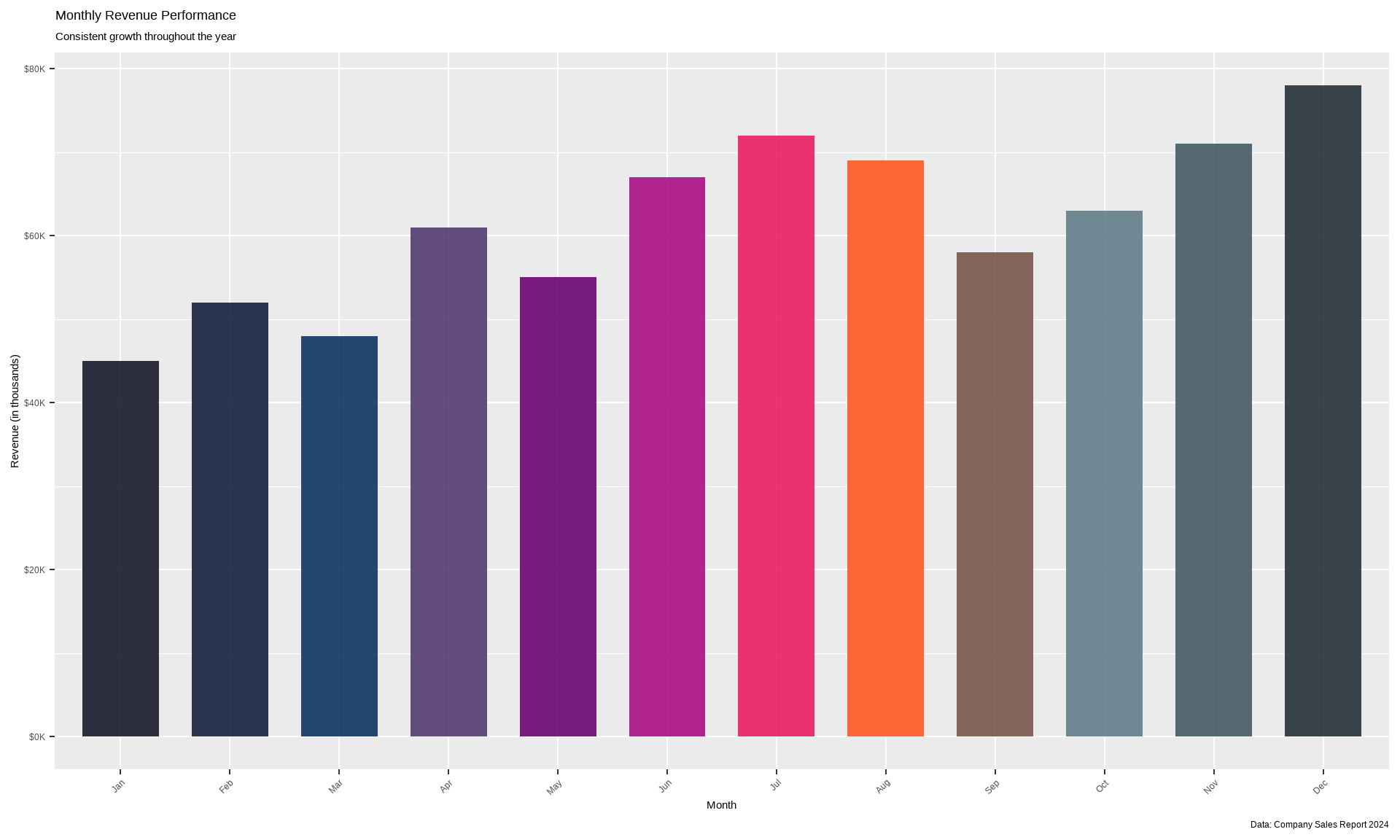
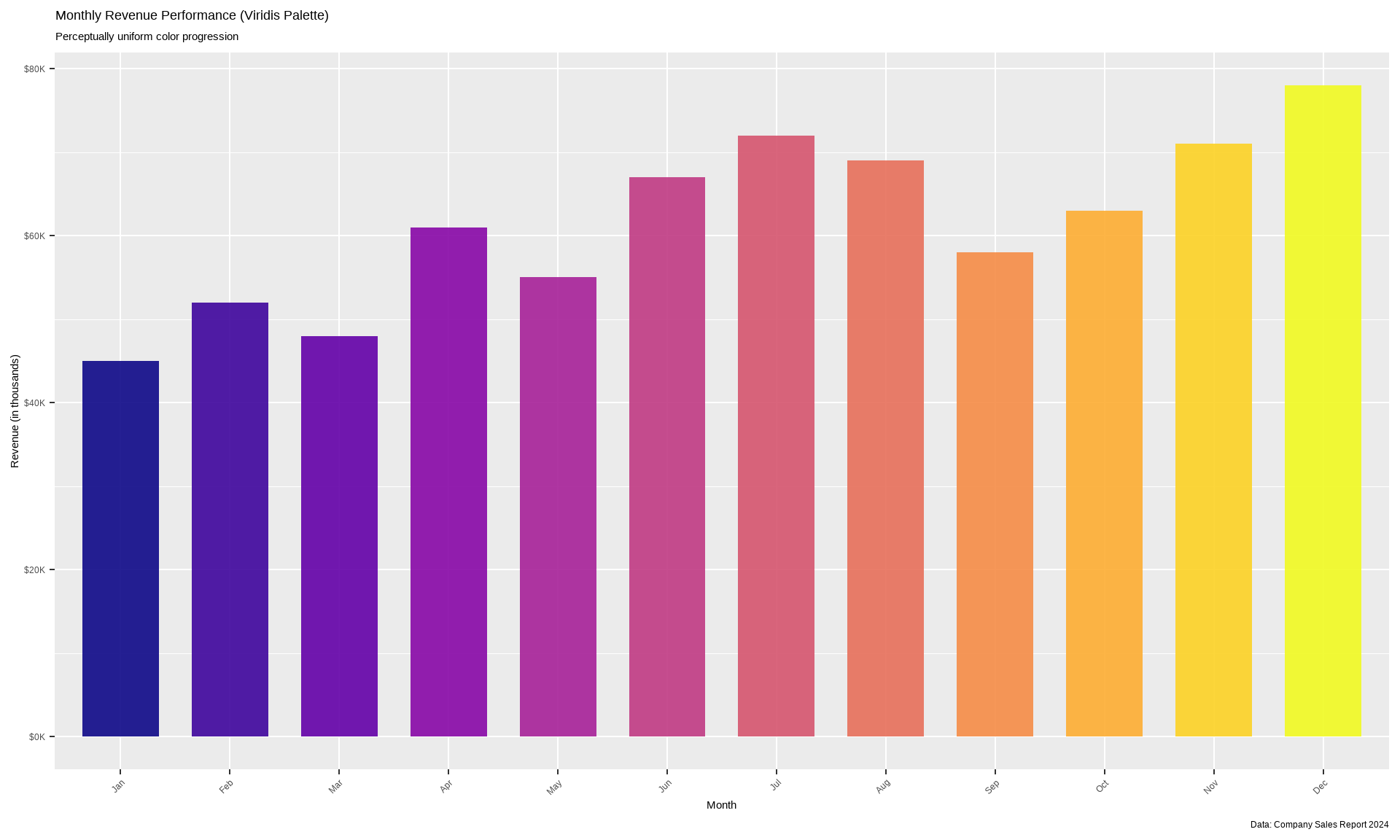
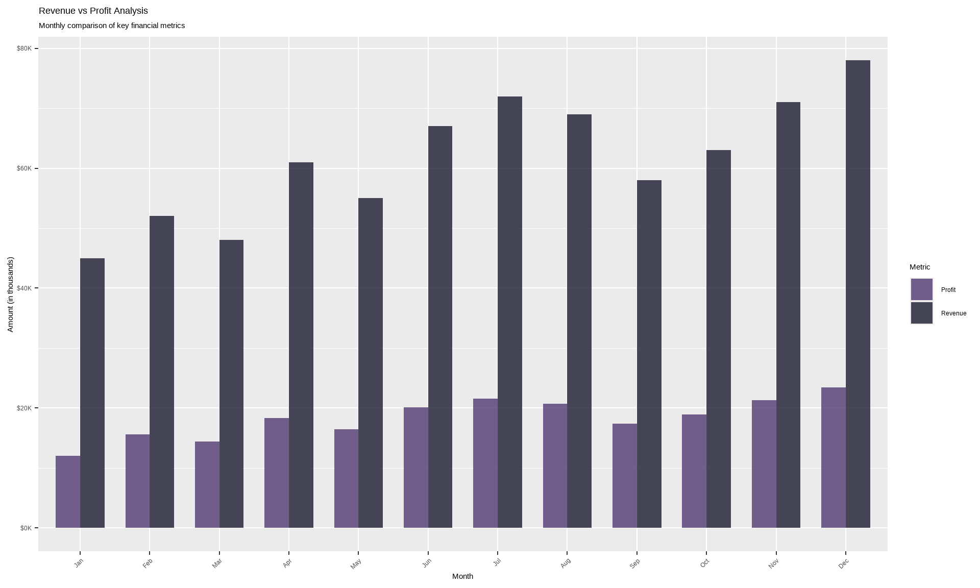
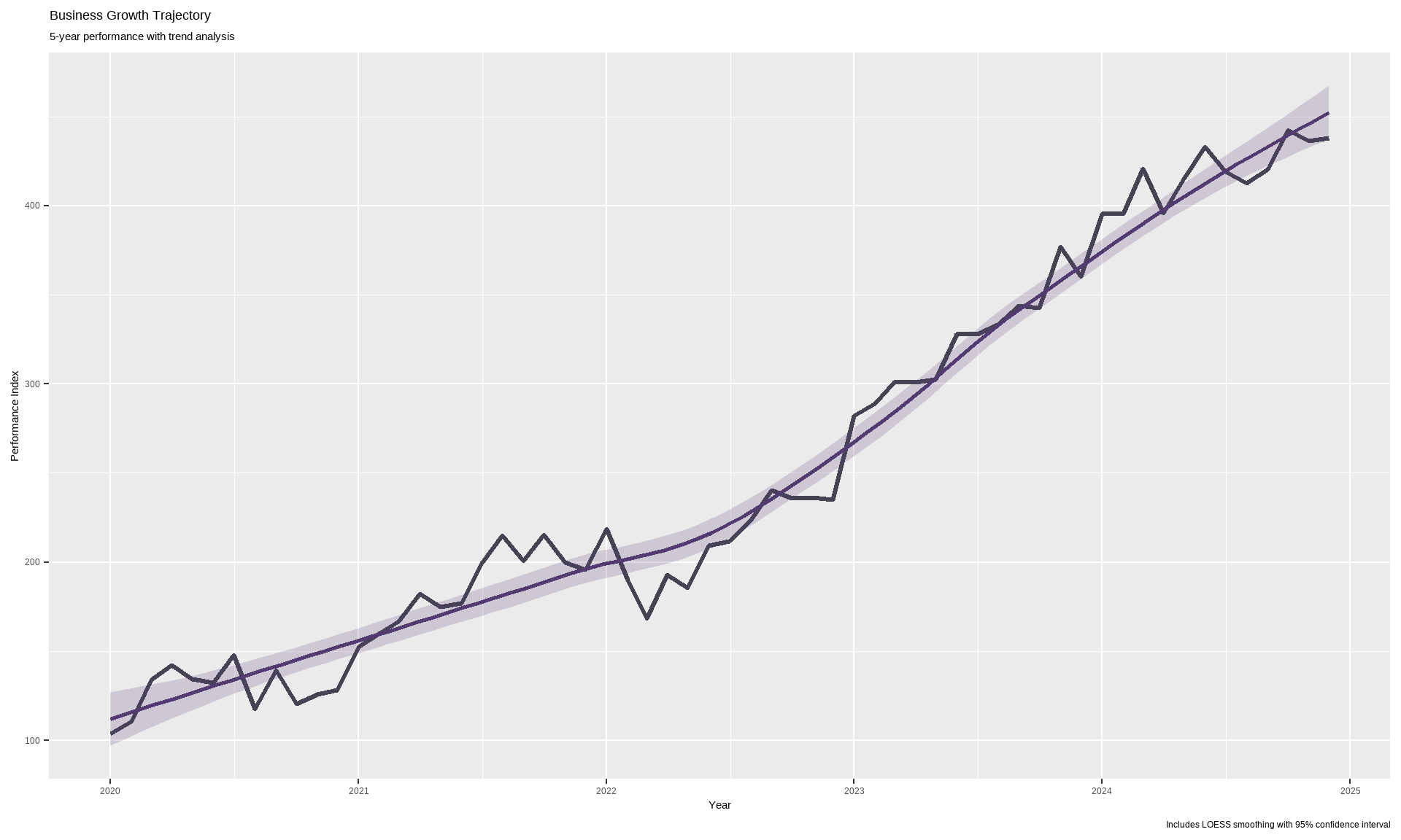
# Load required librarieslibrary(ggplot2)library(dplyr)library(viridis)library(RColorBrewer)library(scales)library(gridExtra)library(ggtext)library(showtext)library(patchwork)# Add Google Fontsfont_add_google("Playfair Display", "playfair")font_add_google("Source Sans Pro", "source")font_add_google("Fira Code", "fira")showtext_auto()# Alternative fonts for Windows compatibilityif (.Platform$OS.type =="windows") {windowsFonts(playfair =windowsFont("Times New Roman"),source =windowsFont("Arial"),fira =windowsFont("Courier New") )}# Custom color palette (expanded to cover 12 months) - Dark & Sophisticatedcustom_colors <-c("#1A1A2E", "#16213E", "#0F3460", "#533A71", "#6A0572", "#AB0E86", "#E91E63", "#FF5722", "#795548", "#607D8B", "#455A64", "#263238")# Alternative dark color palettes for different usesprimary_colors <-c("#1A1A2E", "#16213E", "#0F3460", "#533A71")accent_colors <-c("#6A0572", "#AB0E86", "#E91E63", "#FF5722")dark_gradient <-c("#263238", "#37474F", "#455A64", "#546E7A", "#607D8B", "#78909C")
Show Code
# Create our custom themetheme_elegant <-function(base_size =14, base_family ="source") {# Use fallback fonts on Windows title_family <-if (.Platform$OS.type =="windows") "Times New Roman"else"playfair" body_family <-if (.Platform$OS.type =="windows") "Arial"else"source"theme_minimal(base_size = base_size, base_family = body_family) +theme(# Backgroundplot.background =element_rect(fill ="#FEFEFE", color =NA),panel.background =element_rect(fill ="#FEFEFE", color =NA),# Remove grid linespanel.grid =element_blank(),panel.grid.major =element_blank(),panel.grid.minor =element_blank(),# Axesaxis.line =element_line(color ="#2C3E50", size =0.5),axis.text =element_text(color ="#2C3E50", size =rel(0.9)),axis.title =element_text(color ="#2C3E50", size =rel(1.1), face ="bold"),# Title and subtitleplot.title =element_text(family = title_family, size =rel(1.6), face ="bold", color ="#2C3E50",margin =margin(b =20) ),plot.subtitle =element_text(family = body_family, size =rel(1.1), color ="#7F8C8D",margin =margin(b =25) ),plot.caption =element_text(family = body_family, size =rel(0.8), color ="#95A5A6",hjust =0,margin =margin(t =15) ),# Legendlegend.background =element_rect(fill ="white", color =NA),legend.key =element_rect(fill ="white", color =NA),legend.text =element_text(color ="#2C3E50", size =rel(0.9)),legend.title =element_text(color ="#2C3E50", size =rel(1), face ="bold"),legend.position ="right",# Facetsstrip.background =element_rect(fill ="#ECF0F1", color =NA),strip.text =element_text(color ="#2C3E50", face ="bold", size =rel(1)),# Marginsplot.margin =margin(20, 20, 20, 20) )}# Set as default themetheme_set(theme_elegant())
Sample Data Generation
Let’s create diverse datasets to showcase different types of visualizations:
Conclusion: Best Practices for Beautiful ggplot2 Visualizations
Key Takeaways:
Custom Themes: Creating a consistent, branded look across all your visualizations
Color Psychology: Using colors that enhance readability and convey the right message
Typography: Selecting appropriate fonts that match your visualization’s purpose
White Space: Embracing clean, uncluttered designs with strategic use of white space
Annotations: Adding context and highlighting key insights directly on the plot
Layering: Combining multiple geoms to create rich, informative visualizations
Advanced Tips:
Use scales package for professional formatting of axes
Leverage viridis and RColorBrewer for scientifically-backed color palettes
Apply patchwork for combining multiple plots elegantly
Implement consistent spacing and alignment across plot elements
Consider your audience and the story you want to tell
This comprehensive guide covers the essential plot types in ggplot2, each enhanced with our custom theme that prioritizes clean aesthetics, readability, and visual appeal. The combination of thoughtful color choices, beautiful typography, and strategic use of white space creates visualizations that not only inform but also inspire.
Remember: Great data visualization is not just about the data—it’s about creating a visual narrative that guides your audience to insights in an elegant and memorable way.
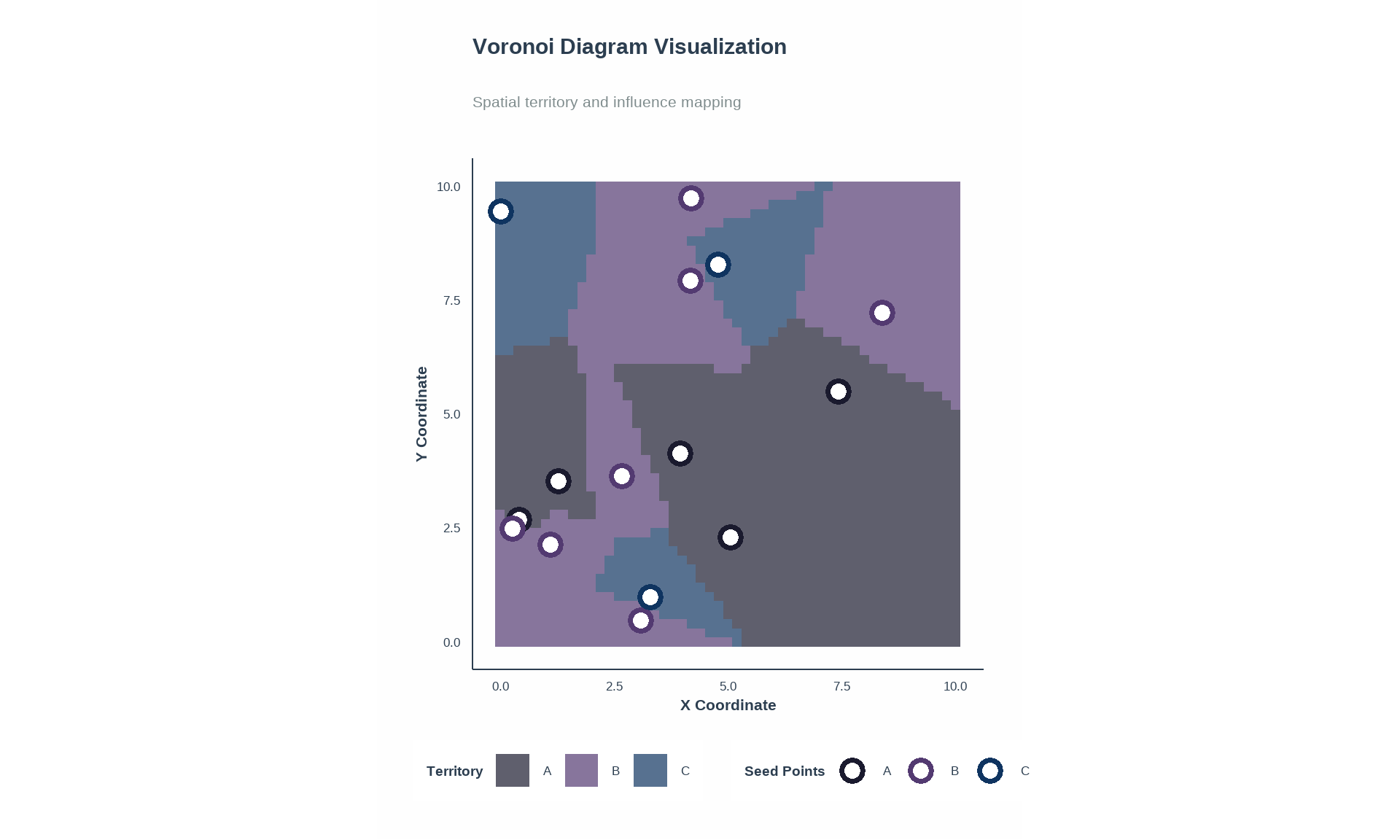
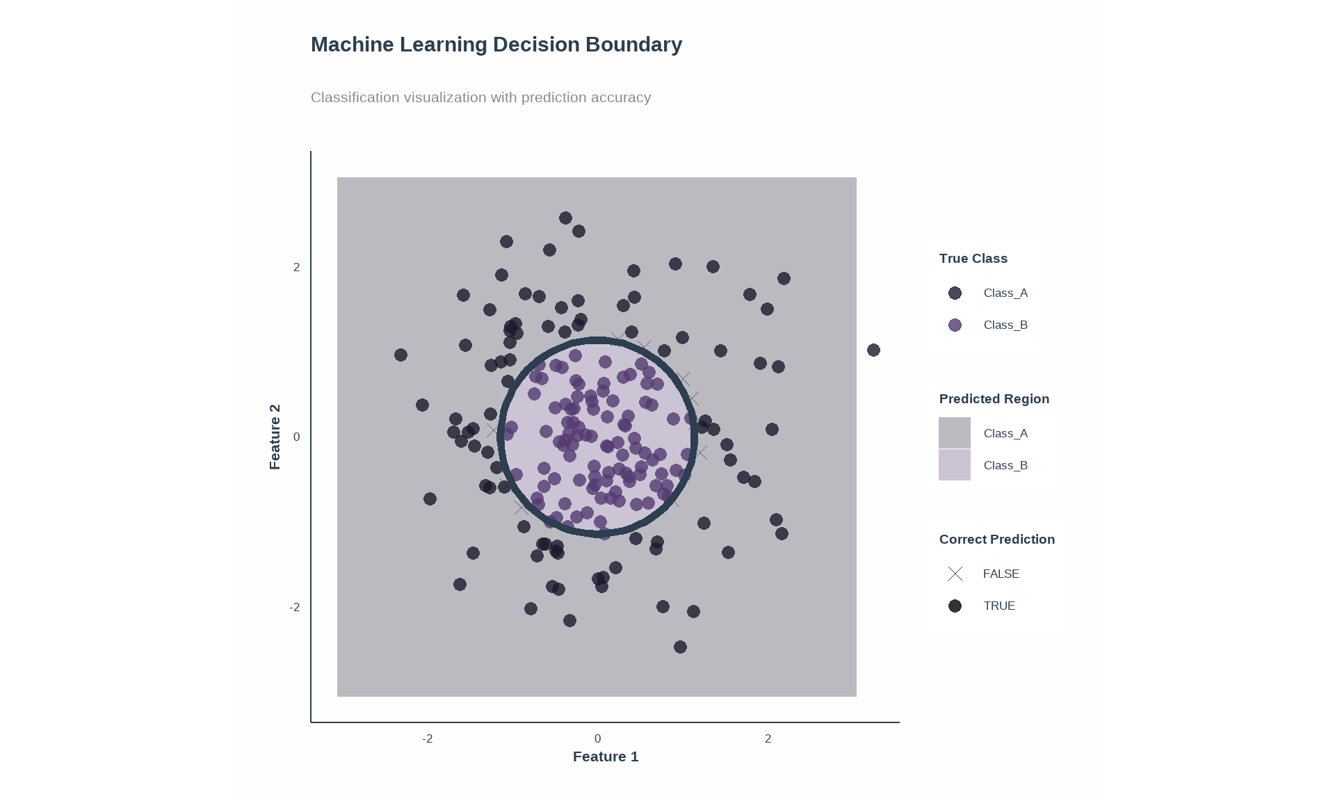
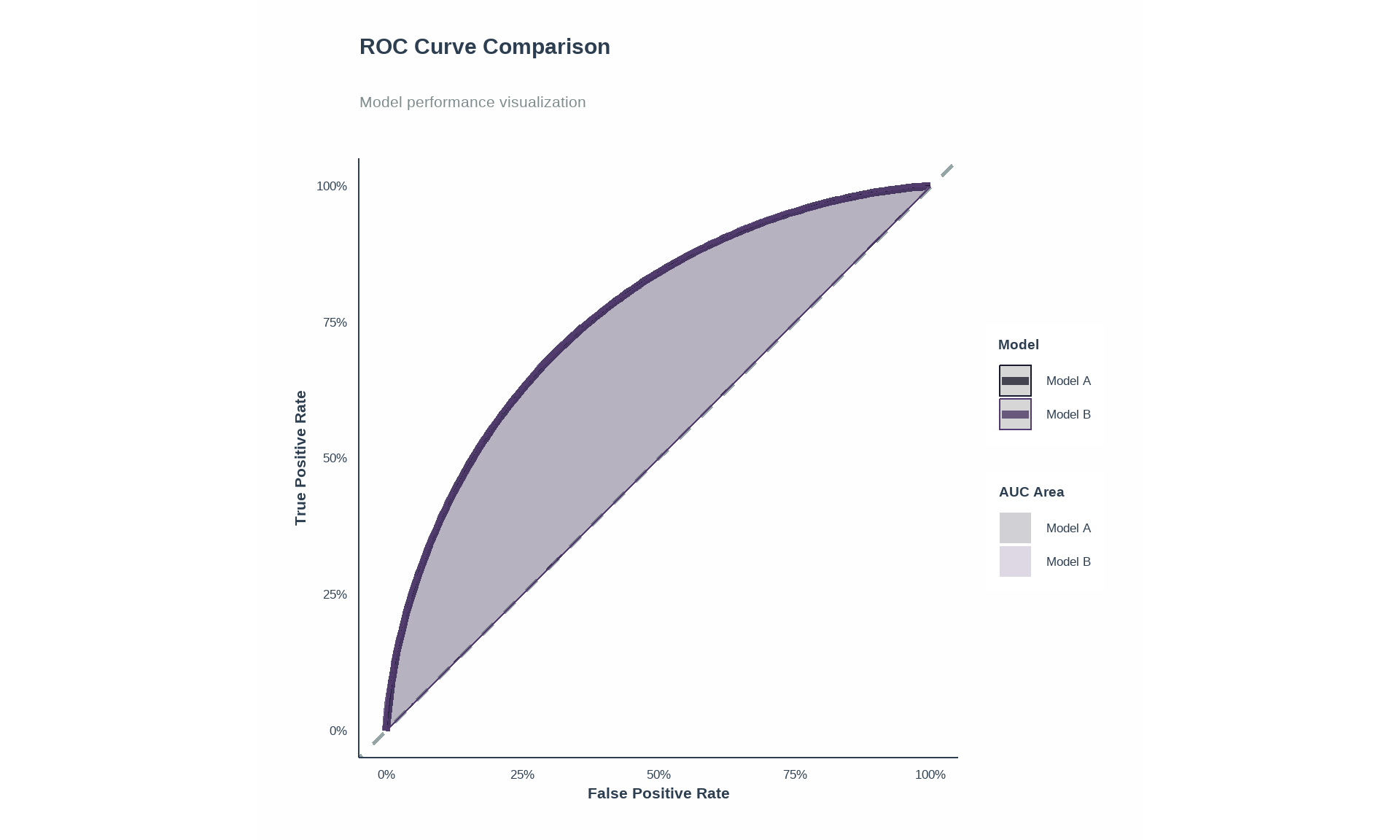
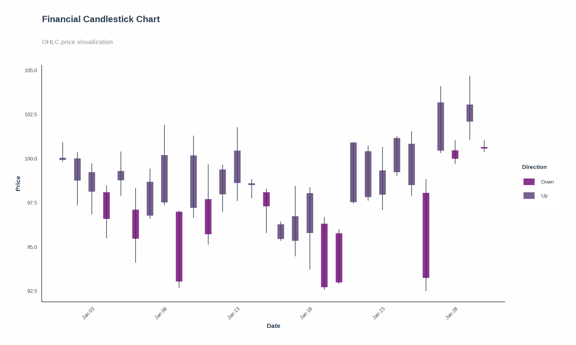
Source Code
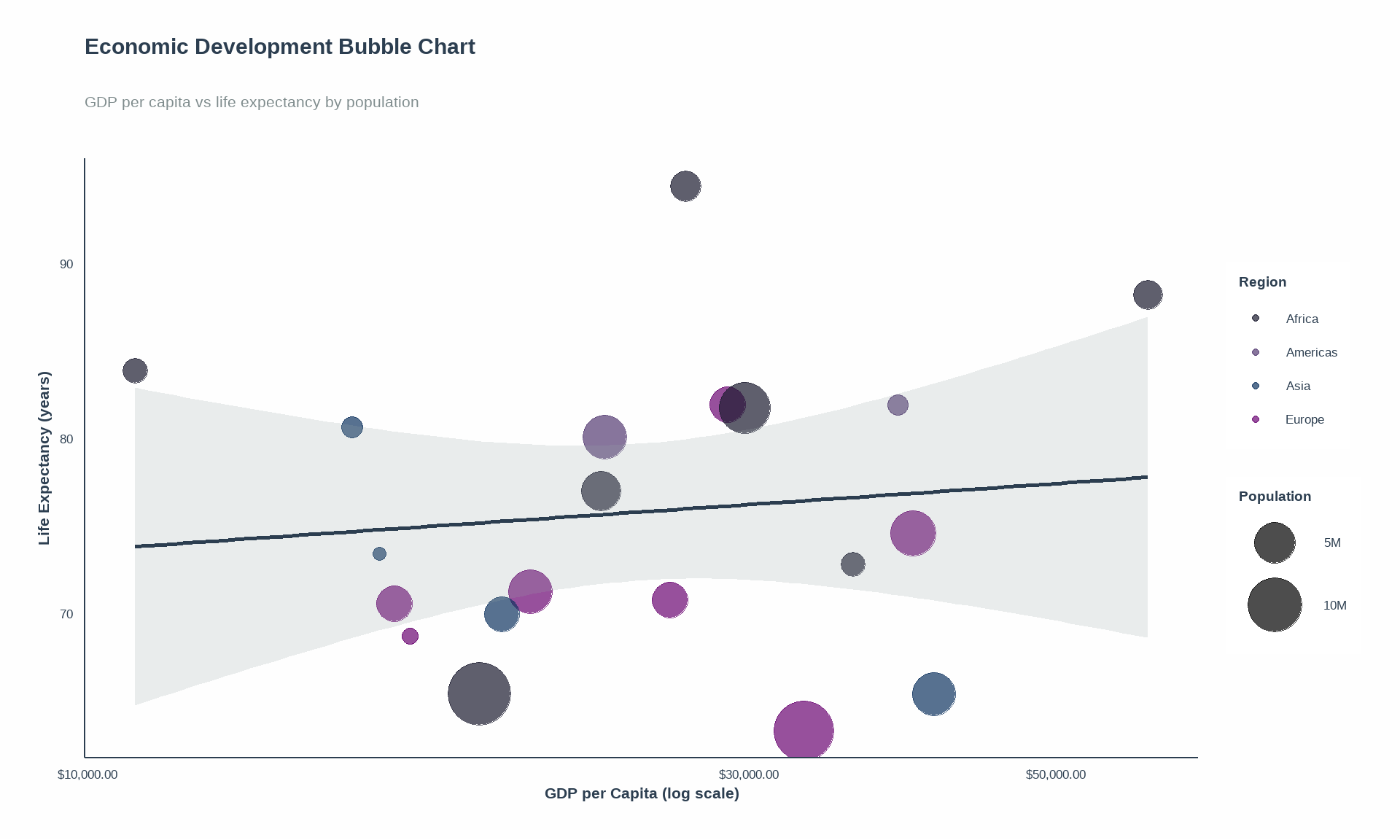
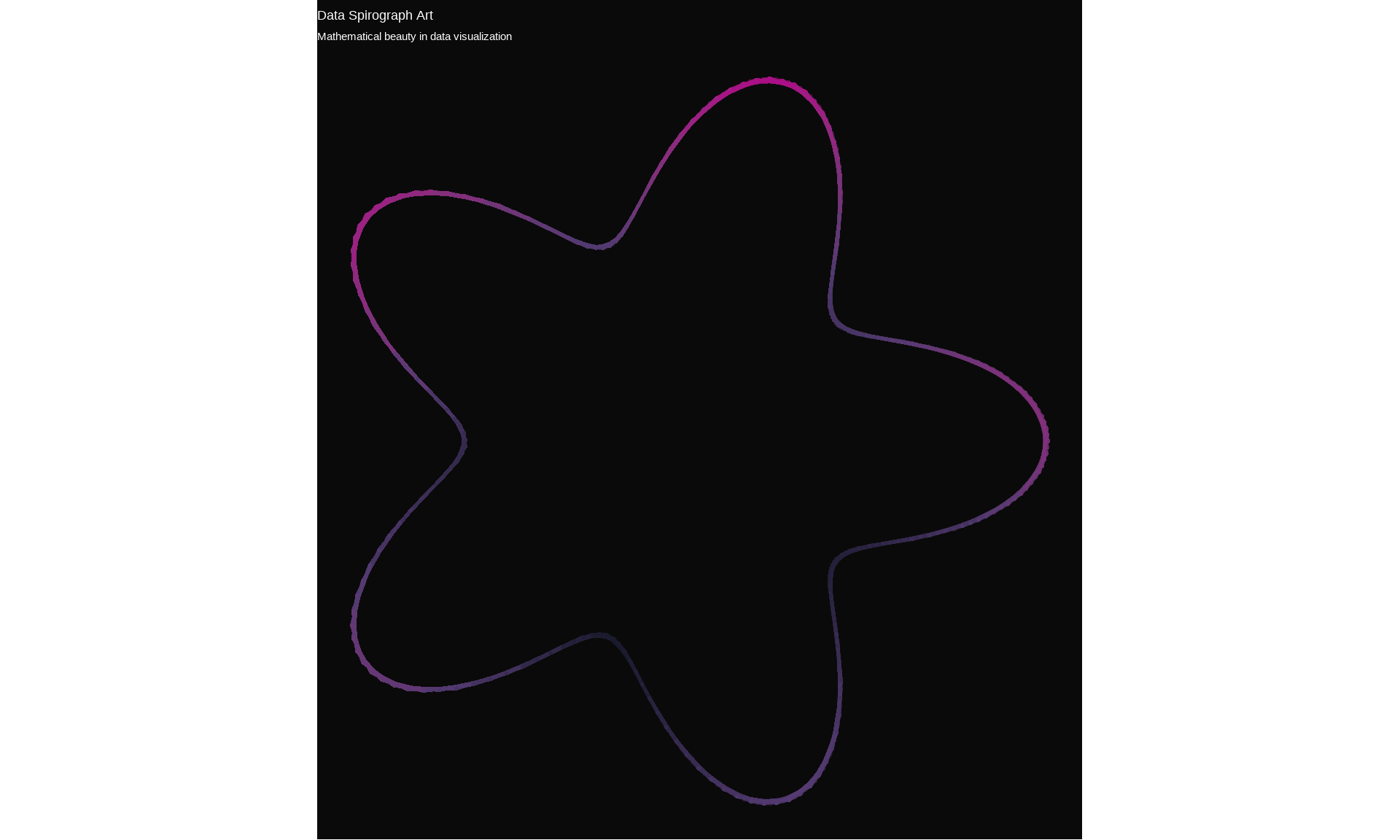
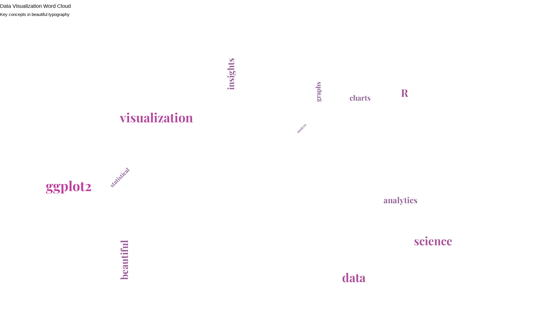
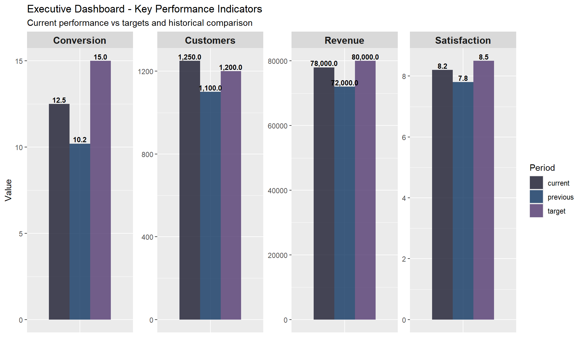
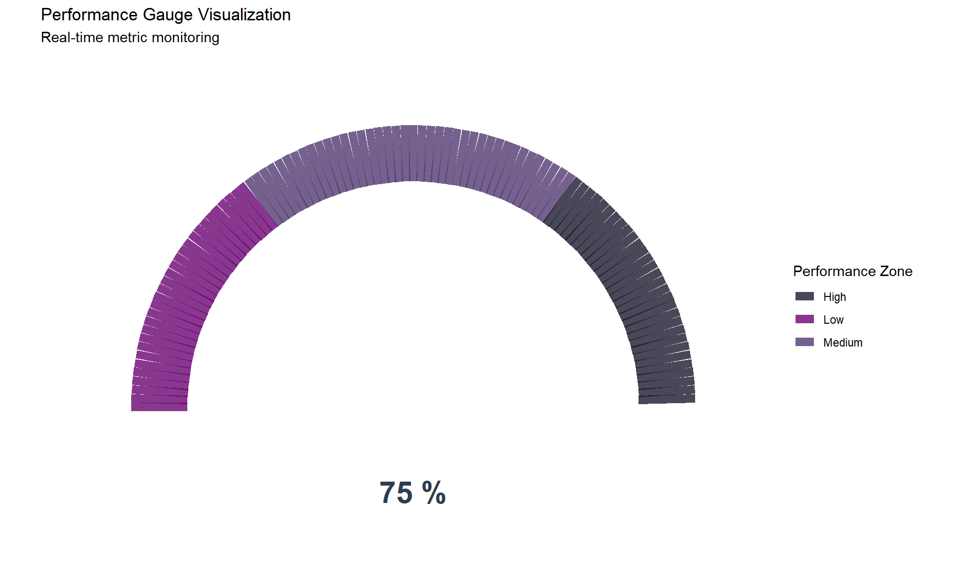
---title: "Complete ggplot2 Visualization Guide: Mastering Beautiful Data Plots"author: "Krishna Kumar Shrestha"date: "2025-07-17"categories: [data visualization, ggplot2, R, data science]description: "A comprehensive guide to creating stunning visualizations with ggplot2, featuring custom themes, advanced techniques, and all major plot types with beautiful aesthetics."format: html: toc: true toc-depth: 3 code-fold: true code-summary: "Show Code" code-tools: true df-print: paged fig-width: 10 fig-height: 6execute: warning: false message: false cache: true---# Complete ggplot2 Visualization Guide: Mastering Beautiful Data PlotsData visualization is the art of transforming numbers into stories. In this comprehensive guide, we'll explore the power of ggplot2 to create stunning, publication-ready visualizations that not only convey information effectively but also captivate your audience with their aesthetic appeal.## Setup and Custom ThemeLet's start by loading the necessary libraries and creating our custom theme that features a clean whitish background, no grid lines, and beautiful typography.```{r setup}# Load required librarieslibrary(ggplot2)library(dplyr)library(viridis)library(RColorBrewer)library(scales)library(gridExtra)library(ggtext)library(showtext)library(patchwork)# Add Google Fontsfont_add_google("Playfair Display", "playfair")font_add_google("Source Sans Pro", "source")font_add_google("Fira Code", "fira")showtext_auto()# Alternative fonts for Windows compatibilityif (.Platform$OS.type =="windows") {windowsFonts(playfair =windowsFont("Times New Roman"),source =windowsFont("Arial"),fira =windowsFont("Courier New") )}# Custom color palette (expanded to cover 12 months) - Dark & Sophisticatedcustom_colors <-c("#1A1A2E", "#16213E", "#0F3460", "#533A71", "#6A0572", "#AB0E86", "#E91E63", "#FF5722", "#795548", "#607D8B", "#455A64", "#263238")# Alternative dark color palettes for different usesprimary_colors <-c("#1A1A2E", "#16213E", "#0F3460", "#533A71")accent_colors <-c("#6A0572", "#AB0E86", "#E91E63", "#FF5722")dark_gradient <-c("#263238", "#37474F", "#455A64", "#546E7A", "#607D8B", "#78909C")``````{r custom_theme}# Create our custom themetheme_elegant <-function(base_size =14, base_family ="source") {# Use fallback fonts on Windows title_family <-if (.Platform$OS.type =="windows") "Times New Roman"else"playfair" body_family <-if (.Platform$OS.type =="windows") "Arial"else"source"theme_minimal(base_size = base_size, base_family = body_family) +theme(# Backgroundplot.background =element_rect(fill ="#FEFEFE", color =NA),panel.background =element_rect(fill ="#FEFEFE", color =NA),# Remove grid linespanel.grid =element_blank(),panel.grid.major =element_blank(),panel.grid.minor =element_blank(),# Axesaxis.line =element_line(color ="#2C3E50", size =0.5),axis.text =element_text(color ="#2C3E50", size =rel(0.9)),axis.title =element_text(color ="#2C3E50", size =rel(1.1), face ="bold"),# Title and subtitleplot.title =element_text(family = title_family, size =rel(1.6), face ="bold", color ="#2C3E50",margin =margin(b =20) ),plot.subtitle =element_text(family = body_family, size =rel(1.1), color ="#7F8C8D",margin =margin(b =25) ),plot.caption =element_text(family = body_family, size =rel(0.8), color ="#95A5A6",hjust =0,margin =margin(t =15) ),# Legendlegend.background =element_rect(fill ="white", color =NA),legend.key =element_rect(fill ="white", color =NA),legend.text =element_text(color ="#2C3E50", size =rel(0.9)),legend.title =element_text(color ="#2C3E50", size =rel(1), face ="bold"),legend.position ="right",# Facetsstrip.background =element_rect(fill ="#ECF0F1", color =NA),strip.text =element_text(color ="#2C3E50", face ="bold", size =rel(1)),# Marginsplot.margin =margin(20, 20, 20, 20) )}# Set as default themetheme_set(theme_elegant())```## Sample Data GenerationLet's create diverse datasets to showcase different types of visualizations:```{r data_generation}# Set seed for reproducibilityset.seed(123)# Dataset 1: Sales datasales_data <-data.frame(month =factor(month.abb, levels = month.abb),revenue =c(45000, 52000, 48000, 61000, 55000, 67000, 72000, 69000, 58000, 63000, 71000, 78000),profit =c(12000, 15600, 14400, 18300, 16500, 20100,21600, 20700, 17400, 18900, 21300, 23400),region =rep(c("North", "South", "East", "West"), 3))# Dataset 2: Customer demographicscustomer_data <-data.frame(age =rnorm(500, 35, 12),income =rnorm(500, 50000, 15000),satisfaction =sample(1:10, 500, replace =TRUE),category =sample(c("Premium", "Standard", "Basic"), 500, replace =TRUE, prob =c(0.3, 0.5, 0.2)),gender =sample(c("Male", "Female", "Other"), 500, replace =TRUE, prob =c(0.45, 0.5, 0.05)))# Dataset 3: Time series datatime_series_data <-data.frame(date =seq(as.Date("2020-01-01"), as.Date("2024-12-31"), by ="month"),value =cumsum(rnorm(60, 5, 15)) +100,trend =seq(100, 400, length.out =60),category =rep(c("A", "B", "C"), 20))# Dataset 4: Correlation matrix datacorrelation_data <-data.frame(x =rnorm(200),y =rnorm(200),z =rnorm(200))correlation_data$y <- correlation_data$x *0.7+ correlation_data$y *0.3correlation_data$z <- correlation_data$x *-0.5+ correlation_data$z *0.5```## 1. Bar Charts and Column ChartsBar charts are perfect for comparing categories and showing distributions.```{r bar_charts}# Simple bar chart with custom colorsp1 <-ggplot(sales_data, aes(x = month, y = revenue, fill = month)) +geom_col(width =0.7, alpha =0.9) +scale_fill_manual(values = custom_colors) +scale_y_continuous(labels = scales::dollar_format(scale =1e-3, suffix ="K")) +labs(title ="Monthly Revenue Performance",subtitle ="Consistent growth throughout the year",x ="Month",y ="Revenue (in thousands)",caption ="Data: Company Sales Report 2024" ) +theme(legend.position ="none",axis.text.x =element_text(angle =45, hjust =1) )# Alternative approach using viridis colors for monthsp1_alt <-ggplot(sales_data, aes(x = month, y = revenue, fill = month)) +geom_col(width =0.7, alpha =0.9) +scale_fill_viridis_d(option ="plasma") +scale_y_continuous(labels = scales::dollar_format(scale =1e-3, suffix ="K")) +labs(title ="Monthly Revenue Performance (Viridis Palette)",subtitle ="Perceptually uniform color progression",x ="Month",y ="Revenue (in thousands)",caption ="Data: Company Sales Report 2024" ) +theme(legend.position ="none",axis.text.x =element_text(angle =45, hjust =1) )# Grouped bar chartp2 <- sales_data %>%select(month, revenue, profit) %>% tidyr::pivot_longer(cols =c(revenue, profit), names_to ="metric", values_to ="value") %>%ggplot(aes(x = month, y = value, fill = metric)) +geom_col(position ="dodge", width =0.7, alpha =0.8) +scale_fill_manual(values =c("revenue"="#1A1A2E", "profit"="#533A71"),labels =c("Profit", "Revenue") ) +scale_y_continuous(labels = scales::dollar_format(scale =1e-3, suffix ="K")) +labs(title ="Revenue vs Profit Analysis",subtitle ="Monthly comparison of key financial metrics",x ="Month",y ="Amount (in thousands)",fill ="Metric" ) +theme(axis.text.x =element_text(angle =45, hjust =1))print(p1)print(p1_alt)print(p2)```## 2. Line Charts and Time SeriesLine charts excel at showing trends over time and continuous relationships.```{r line_charts}# Simple time series plotp3 <-ggplot(time_series_data, aes(x = date, y = value)) +geom_line(color ="#1A1A2E", size =1.2, alpha =0.8) +geom_smooth(method ="loess", se =TRUE, color ="#533A71", fill ="#533A71", alpha =0.2) +scale_x_date(date_labels ="%Y", date_breaks ="1 year") +scale_y_continuous(labels = scales::comma_format()) +labs(title ="Business Growth Trajectory",subtitle ="5-year performance with trend analysis",x ="Year",y ="Performance Index",caption ="Includes LOESS smoothing with 95% confidence interval" )# Multiple line chartp4 <- time_series_data %>%group_by(category, year = lubridate::year(date)) %>%summarise(avg_value =mean(value), .groups ="drop") %>%ggplot(aes(x = year, y = avg_value, color = category)) +geom_line(size =1.5, alpha =0.9) +geom_point(size =3, alpha =0.8) +scale_color_manual(values =c("#1A1A2E", "#533A71", "#0F3460")) +scale_x_continuous(breaks =2020:2024) +labs(title ="Category Performance Comparison",subtitle ="Annual trends across different business segments",x ="Year",y ="Average Performance",color ="Category" )print(p3)print(p4)```## 3. Scatter Plots and Correlation AnalysisScatter plots reveal relationships between continuous variables.```{r scatter_plots}# Basic scatter plot with regression linep5 <-ggplot(customer_data, aes(x = age, y = income)) +geom_point(aes(color = category), size =2.5, alpha =0.7) +geom_smooth(method ="lm", se =TRUE, color ="#2C3E50", fill ="#95A5A6", alpha =0.2) +scale_color_manual(values =c("#1A1A2E", "#533A71", "#0F3460")) +scale_y_continuous(labels = scales::dollar_format()) +labs(title ="Income vs Age Relationship",subtitle ="Customer segmentation analysis with linear trend",x ="Age (years)",y ="Annual Income",color ="Customer Category" )# Bubble chartp6 <- customer_data %>%group_by(category, gender) %>%summarise(avg_age =mean(age),avg_income =mean(income),count =n(),.groups ="drop" ) %>%ggplot(aes(x = avg_age, y = avg_income, size = count, color = category)) +geom_point(alpha =0.8) +scale_size_continuous(range =c(5, 20), guide =guide_legend(title ="Count")) +scale_color_manual(values =c("#1A1A2E", "#533A71", "#0F3460")) +scale_y_continuous(labels = scales::dollar_format()) +facet_wrap(~gender) +labs(title ="Customer Demographics Bubble Chart",subtitle ="Age, income, and count by category and gender",x ="Average Age",y ="Average Income",color ="Category",size ="Customer Count" )print(p5)print(p6)```## 4. Histograms and Density PlotsThese plots show distributions and frequency patterns in your data.```{r histograms_density}# Histogram with density overlayp7 <-ggplot(customer_data, aes(x = income)) +geom_histogram(aes(y = ..density..), bins =30, fill ="#1A1A2E", alpha =0.7, color ="white") +geom_density(color ="#533A71", size =1.2) +scale_x_continuous(labels = scales::dollar_format()) +labs(title ="Income Distribution Analysis",subtitle ="Histogram with overlaid density curve",x ="Annual Income",y ="Density" )# Faceted density plotsp8 <-ggplot(customer_data, aes(x = income, fill = category)) +geom_density(alpha =0.7) +scale_fill_manual(values =c("#1A1A2E", "#533A71", "#0F3460")) +scale_x_continuous(labels = scales::dollar_format()) +facet_wrap(~category, scales ="free_y") +labs(title ="Income Distribution by Customer Category",subtitle ="Density plots revealing different spending patterns",x ="Annual Income",y ="Density",fill ="Category" ) +theme(legend.position ="none")print(p7)print(p8)```## 5. Box Plots and Violin PlotsThese plots show distributions, quartiles, and outliers effectively.```{r box_violin_plots}# Enhanced box plotp9 <-ggplot(customer_data, aes(x = category, y = satisfaction, fill = category)) +geom_violin(alpha =0.5, width =0.8) +geom_boxplot(width =0.3, alpha =0.8, outlier.shape =21, outlier.size =2) +geom_jitter(alpha =0.3, width =0.2, size =1) +scale_fill_manual(values =c("#1A1A2E", "#533A71", "#0F3460")) +scale_y_continuous(breaks =1:10) +labs(title ="Customer Satisfaction Distribution",subtitle ="Violin plots with box plots and individual data points",x ="Customer Category",y ="Satisfaction Score (1-10)",fill ="Category" ) +theme(legend.position ="none")# Grouped box plotp10 <-ggplot(customer_data, aes(x = category, y = income, fill = gender)) +geom_boxplot(alpha =0.8, outlier.shape =21) +scale_fill_manual(values =c("#1A1A2E", "#533A71", "#6A0572")) +scale_y_continuous(labels = scales::dollar_format()) +labs(title ="Income Distribution by Category and Gender",subtitle ="Grouped box plots revealing demographic patterns",x ="Customer Category",y ="Annual Income",fill ="Gender" )print(p9)print(p10)```## 6. Heatmaps and Correlation MatricesHeatmaps are excellent for showing relationships and patterns in matrix data.```{r heatmaps}# Correlation heatmapcor_matrix <-cor(correlation_data)cor_df <-expand.grid(Var1 =rownames(cor_matrix), Var2 =colnames(cor_matrix))cor_df$value <-as.vector(cor_matrix)p11 <-ggplot(cor_df, aes(x = Var1, y = Var2, fill = value)) +geom_tile(color ="white", size =0.5) +geom_text(aes(label =round(value, 2)), color ="white", size =5, family ="fira") +scale_fill_gradient2(low ="#1A1A2E", mid ="white", high ="#533A71", midpoint =0,name ="Correlation" ) +labs(title ="Correlation Matrix Heatmap",subtitle ="Relationships between variables",x ="", y ="" ) +theme(axis.text.x =element_text(angle =45, hjust =1),panel.border =element_rect(color ="#2C3E50", fill =NA, size =1) )# Monthly sales heatmapmonthly_matrix <- sales_data %>%select(month, revenue, profit) %>% tidyr::pivot_longer(cols =c(revenue, profit), names_to ="metric") %>%mutate(value_scaled =scale(value)[,1])p12 <-ggplot(monthly_matrix, aes(x = month, y = metric, fill = value_scaled)) +geom_tile(color ="white", size =0.5) +scale_fill_gradient2(low ="#1A1A2E", mid ="white", high ="#533A71",name ="Scaled\nValue" ) +labs(title ="Monthly Performance Heatmap",subtitle ="Standardized revenue and profit metrics",x ="Month", y ="Metric" ) +theme(axis.text.x =element_text(angle =45, hjust =1))print(p11)print(p12)```## 7. Pie Charts and Donut ChartsWhile sometimes criticized, pie charts can be effective for showing parts of a whole.```{r pie_donut_charts}# Enhanced pie chartcategory_counts <- customer_data %>%count(category) %>%mutate(percentage = n /sum(n) *100,label =paste0(category, "\n", round(percentage, 1), "%") )p13 <-ggplot(category_counts, aes(x ="", y = n, fill = category)) +geom_col(width =1, alpha =0.8) +coord_polar(theta ="y") +scale_fill_manual(values =c("#1A1A2E", "#533A71", "#0F3460")) +geom_text(aes(label = label), position =position_stack(vjust =0.5),color ="white", size =4, family ="source",fontface ="bold") +labs(title ="Customer Category Distribution",subtitle ="Market segmentation overview" ) +theme_void() +theme(plot.title =element_text(family ="playfair", size =rel(1.6), face ="bold", color ="#2C3E50"),plot.subtitle =element_text(family ="source", size =rel(1.1), color ="#7F8C8D"),legend.position ="none" )# Donut chartp14 <-ggplot(category_counts, aes(x =2, y = n, fill = category)) +geom_col(alpha =0.8) +coord_polar(theta ="y") +xlim(0.5, 2.5) +scale_fill_manual(values =c("#1A1A2E", "#533A71", "#0F3460")) +labs(title ="Customer Segments - Donut View",subtitle ="Clean modern representation",fill ="Category" ) +theme_void() +theme(plot.title =element_text(family ="playfair", size =rel(1.6), face ="bold", color ="#2C3E50"),plot.subtitle =element_text(family ="source", size =rel(1.1), color ="#7F8C8D") )print(p13)print(p14)```## 8. Advanced Plots: Ridgeline and WaterfallLet's explore some advanced visualization techniques.```{r advanced_plots}# Ridgeline plot (requires ggridges)library(ggridges)p15 <-ggplot(customer_data, aes(x = income, y = category, fill = category)) +geom_density_ridges(alpha =0.8, scale =0.9) +scale_fill_manual(values =c("#1A1A2E", "#533A71", "#0F3460")) +scale_x_continuous(labels = scales::dollar_format()) +labs(title ="Income Distribution Ridgeline Plot",subtitle ="Elegant way to compare distributions across categories",x ="Annual Income",y ="Customer Category" ) +theme(legend.position ="none")# Waterfall chart simulationwaterfall_data <-data.frame(category =c("Starting", "Q1 Growth", "Q2 Growth", "Q3 Decline", "Q4 Growth", "Ending"),value =c(100, 25, 30, -15, 20, 160),type =c("start", "increase", "increase", "decrease", "increase", "end"))waterfall_data$cumulative <-cumsum(waterfall_data$value)waterfall_data$xmin <-1:nrow(waterfall_data) -0.4waterfall_data$xmax <-1:nrow(waterfall_data) +0.4waterfall_data$ymin <-c(0, head(waterfall_data$cumulative, -1))waterfall_data$ymax <- waterfall_data$cumulativep16 <-ggplot(waterfall_data) +geom_rect(aes(xmin = xmin, xmax = xmax, ymin = ymin, ymax = ymax, fill = type), alpha =0.8, color ="white", size =0.5) +geom_text(aes(x =1:nrow(waterfall_data), y = ymax +5, label =paste0("+", value)), family ="source", fontface ="bold", color ="#2C3E50") +scale_fill_manual(values =c("start"="#455A64", "increase"="#533A71", "decrease"="#6A0572", "end"="#1A1A2E")) +scale_x_continuous(breaks =1:6, labels = waterfall_data$category) +labs(title ="Business Performance Waterfall Chart",subtitle ="Quarterly progression breakdown",x ="", y ="Performance Value",fill ="Type" ) +theme(axis.text.x =element_text(angle =45, hjust =1))print(p15)print(p16)```## 9. Faceting and Small MultiplesFaceting allows you to create multiple plots based on grouping variables.```{r faceting_plots}# Facet wrap examplep17 <-ggplot(customer_data, aes(x = age, y = income, color = satisfaction)) +geom_point(size =2, alpha =0.7) +geom_smooth(method ="lm", se =FALSE, color ="#2C3E50") +scale_color_viridis_c(option ="plasma") +scale_y_continuous(labels = scales::dollar_format()) +facet_wrap(~category, scales ="free") +labs(title ="Age-Income Relationship Across Customer Categories",subtitle ="Satisfaction levels shown by color intensity",x ="Age", y ="Income", color ="Satisfaction" )# Facet grid exampletime_analysis <- time_series_data %>%mutate(year = lubridate::year(date),quarter =paste0("Q", lubridate::quarter(date)) ) %>%filter(year %in%2022:2024)p18 <-ggplot(time_analysis, aes(x = quarter, y = value, fill = category)) +geom_col(position ="dodge", alpha =0.8) +scale_fill_manual(values =c("#1A1A2E", "#533A71", "#0F3460")) +facet_grid(year ~ ., scales ="free_y") +labs(title ="Quarterly Performance by Category and Year",subtitle ="Faceted analysis showing temporal patterns",x ="Quarter", y ="Performance Value", fill ="Category" )print(p17)print(p18)```## 10. Interactive Elements and AnnotationsAdding annotations and highlights to make your plots more informative.```{r annotations_highlights}# Plot with annotationsbest_month <- sales_data[which.max(sales_data$revenue), ]p19 <-ggplot(sales_data, aes(x = month, y = revenue)) +geom_col(aes(fill = month == best_month$month), width =0.7, alpha =0.8) +scale_fill_manual(values =c("FALSE"="#455A64", "TRUE"="#1A1A2E"), guide ="none") +scale_y_continuous(labels = scales::dollar_format(scale =1e-3, suffix ="K")) +annotate("text", x =which(sales_data$month == best_month$month), y = best_month$revenue +2000,label =paste("Peak Month\n$", scales::comma(best_month$revenue)),family ="source", fontface ="bold", color ="#2C3E50",hjust =0.5) +annotate("curve", x =which(sales_data$month == best_month$month) +0.5, y = best_month$revenue +1000,xend =which(sales_data$month == best_month$month) +0.1, yend = best_month$revenue +500,arrow =arrow(length =unit(0.2, "cm")), color ="#533A71", size =1) +labs(title ="Revenue Performance with Peak Highlight",subtitle ="Annotations draw attention to key insights",x ="Month", y ="Revenue (in thousands)" ) +theme(axis.text.x =element_text(angle =45, hjust =1))# Multi-layer plot with trend analysisp20 <-ggplot(time_series_data, aes(x = date)) +# Background ribbon for trendgeom_ribbon(aes(ymin = trend -50, ymax = trend +50), fill ="#533A71", alpha =0.2) +# Actual valuesgeom_line(aes(y = value), color ="#1A1A2E", size =1.2) +# Trend linegeom_line(aes(y = trend), color ="#2C3E50", size =1, linetype ="dashed") +# Highlight recent periodgeom_rect(aes(xmin =as.Date("2024-01-01"), xmax =as.Date("2024-12-31"),ymin =-Inf, ymax =Inf), fill ="#6A0572", alpha =0.1) +scale_x_date(date_labels ="%Y", date_breaks ="1 year") +labs(title ="Performance Analysis with Trend Confidence Interval",subtitle ="Recent period highlighted in yellow, trend shown with confidence band",x ="Date", y ="Performance Value",caption ="Dashed line shows underlying trend, ribbon shows ±50 confidence band" )print(p19)print(p20)```## 11. Area Charts and Stacked PlotsArea charts are excellent for showing cumulative values and trends over time.```{r area_charts}# Simple area chartp21 <-ggplot(time_series_data, aes(x = date, y = value)) +geom_area(fill ="#1A1A2E", alpha =0.7) +geom_line(color ="#533A71", size =1.2) +scale_x_date(date_labels ="%Y", date_breaks ="1 year") +scale_y_continuous(labels = scales::comma_format()) +labs(title ="Performance Area Chart",subtitle ="Cumulative performance visualization over time",x ="Year",y ="Performance Value" )# Stacked area chartarea_data <- time_series_data %>%group_by(date) %>%mutate(category_value =case_when( category =="A"~ value *0.4, category =="B"~ value *0.35, category =="C"~ value *0.25 ) ) %>%ungroup()p22 <-ggplot(area_data, aes(x = date, y = category_value, fill = category)) +geom_area(alpha =0.8, position ="stack") +scale_fill_manual(values =c("#1A1A2E", "#533A71", "#0F3460")) +scale_x_date(date_labels ="%Y", date_breaks ="1 year") +scale_y_continuous(labels = scales::comma_format()) +labs(title ="Stacked Area Chart by Category",subtitle ="Component contribution to total performance",x ="Year",y ="Performance Value",fill ="Category" )print(p21)print(p22)```## 12. Polar and Radar ChartsPolar coordinates can create unique and effective visualizations.```{r polar_charts}# Polar bar chart (rose chart)monthly_summary <- sales_data %>%mutate(month_num =as.numeric(month))p23 <-ggplot(monthly_summary, aes(x = month, y = revenue, fill = month)) +geom_col(width =0.8, alpha =0.8) +scale_fill_manual(values = custom_colors) +coord_polar(start =0) +scale_y_continuous(labels = scales::dollar_format(scale =1e-3, suffix ="K")) +labs(title ="Circular Revenue Chart",subtitle ="Monthly performance in polar coordinates",y ="Revenue (thousands)" ) +theme(legend.position ="none",axis.text.x =element_text(size =rel(0.8)) )# Radar chart simulationradar_data <- customer_data %>%group_by(category) %>%summarise(avg_age =mean(age, na.rm =TRUE),avg_income =mean(income, na.rm =TRUE) /1000, # Scale downavg_satisfaction =mean(satisfaction, na.rm =TRUE),count =n() /10, # Scale down.groups ="drop" ) %>% tidyr::pivot_longer(cols =-category, names_to ="metric", values_to ="value") %>%mutate(# Normalize values to 0-10 scalevalue_norm = scales::rescale(value, to =c(1, 10)) )p24 <-ggplot(radar_data, aes(x = metric, y = value_norm, fill = category)) +geom_col(position ="dodge", alpha =0.7, width =0.8) +scale_fill_manual(values =c("#1A1A2E", "#533A71", "#0F3460")) +coord_polar() +facet_wrap(~category) +labs(title ="Customer Profile Radar Charts",subtitle ="Multi-dimensional comparison across categories",y ="Normalized Score" ) +theme(legend.position ="none",axis.text.x =element_text(size =rel(0.7)) )print(p23)print(p24)```## 13. Statistical PlotsAdvanced statistical visualizations for deeper analysis.```{r statistical_plots}# Q-Q plot for normality testingp25 <-ggplot(customer_data, aes(sample = income)) +stat_qq(color ="#1A1A2E", alpha =0.7, size =2) +stat_qq_line(color ="#533A71", size =1.2) +facet_wrap(~category) +labs(title ="Q-Q Plots for Income Distribution",subtitle ="Testing normality assumption by customer category",x ="Theoretical Quantiles",y ="Sample Quantiles" )# Error bars and confidence intervalserror_data <- customer_data %>%group_by(category, gender) %>%summarise(mean_income =mean(income, na.rm =TRUE),sd_income =sd(income, na.rm =TRUE),n =n(),se_income = sd_income /sqrt(n),ci_lower = mean_income -1.96* se_income,ci_upper = mean_income +1.96* se_income,.groups ="drop" )p26 <-ggplot(error_data, aes(x = category, y = mean_income, fill = gender)) +geom_col(position ="dodge", alpha =0.8) +geom_errorbar(aes(ymin = ci_lower, ymax = ci_upper),position =position_dodge(width =0.9),width =0.2,color ="#2C3E50",size =0.8 ) +scale_fill_manual(values =c("#1A1A2E", "#533A71", "#6A0572")) +scale_y_continuous(labels = scales::dollar_format()) +labs(title ="Mean Income with 95% Confidence Intervals",subtitle ="Statistical significance testing across groups",x ="Customer Category",y ="Mean Annual Income",fill ="Gender" )print(p25)print(p26)```## 14. Network and Flow DiagramsVisualizing relationships and flows between entities.```{r network_flow_plots}# Alluvial/Sankey-style plotflow_data <- customer_data %>%count(category, gender, satisfaction >7) %>%rename(high_satisfaction =`satisfaction > 7`) %>%mutate(satisfaction_level =ifelse(high_satisfaction, "High", "Low"),flow_id =row_number() )# Create flow visualization using area plotsp27 <- flow_data %>%mutate(x1 =1, x2 =2, x3 =3,category_y =as.numeric(as.factor(category)),gender_y =as.numeric(as.factor(gender)) +3,satisfaction_y =as.numeric(as.factor(satisfaction_level)) +6 ) %>%ggplot() +# Category to Gender flowsgeom_segment(aes(x = x1, y = category_y, xend = x2, yend = gender_y, size = n),color ="#1A1A2E", alpha =0.6) +# Gender to Satisfaction flows geom_segment(aes(x = x2, y = gender_y, xend = x3, yend = satisfaction_y, size = n),color ="#533A71", alpha =0.6) +# Add points for nodesgeom_point(aes(x = x1, y = category_y), size =8, color ="#1A1A2E") +geom_point(aes(x = x2, y = gender_y), size =8, color ="#533A71") +geom_point(aes(x = x3, y = satisfaction_y), size =8, color ="#0F3460") +scale_size_continuous(range =c(1, 10), guide ="none") +scale_x_continuous(breaks =1:3, labels =c("Category", "Gender", "Satisfaction")) +labs(title ="Customer Flow Diagram",subtitle ="Relationships between category, gender, and satisfaction",x ="", y ="" ) +theme(axis.text.y =element_blank(),axis.ticks.y =element_blank() )# Chord diagram simulation using polar coordinateschord_data <- customer_data %>%count(category, gender) %>%mutate(angle =seq(0, 2*pi, length.out =n()),radius = scales::rescale(n, to =c(2, 5)) )p28 <-ggplot(chord_data, aes(x = angle, y = radius)) +geom_col(aes(fill = category), width =0.3, alpha =0.8) +scale_fill_manual(values =c("#1A1A2E", "#533A71", "#0F3460")) +coord_polar(start =0) +labs(title ="Circular Relationship Plot",subtitle ="Category-Gender distribution in polar coordinates",fill ="Category" ) +theme_void()print(p27)print(p28)```## 15. Advanced Distribution PlotsSophisticated ways to visualize and compare distributions.```{r advanced_distributions}# Strip charts with jitterp29 <-ggplot(customer_data, aes(x = category, y = income, color = category)) +geom_jitter(alpha =0.6, width =0.3, size =1.5) +stat_summary(fun = median, geom ="crossbar", width =0.5, color ="#2C3E50", size =1) +scale_color_manual(values =c("#1A1A2E", "#533A71", "#0F3460")) +scale_y_continuous(labels = scales::dollar_format()) +labs(title ="Income Distribution Strip Chart",subtitle ="Individual data points with median crossbars",x ="Customer Category",y ="Annual Income" ) +theme(legend.position ="none")# Slope graphslope_data <- sales_data %>%select(month, revenue, profit) %>%filter(month %in%c("Jan", "Jun", "Dec")) %>% tidyr::pivot_longer(cols =c(revenue, profit), names_to ="metric", values_to ="value") %>%mutate(month =factor(month, levels =c("Jan", "Jun", "Dec")))p30 <-ggplot(slope_data, aes(x = month, y = value, group = metric, color = metric)) +geom_line(size =2, alpha =0.8) +geom_point(size =4, alpha =0.9) +geom_text(aes(label = scales::dollar(value, scale =1e-3, suffix ="K")), vjust =-0.5, family ="source", fontface ="bold", size =3) +scale_color_manual(values =c("profit"="#1A1A2E", "revenue"="#533A71")) +scale_y_continuous(labels = scales::dollar_format(scale =1e-3, suffix ="K")) +labs(title ="Revenue vs Profit Slope Graph",subtitle ="Performance progression across key months",x ="Month",y ="Amount (thousands)",color ="Metric" )print(p29)print(p30)```## 16. Specialized Business PlotsIndustry-specific and business-focused visualizations.```{r business_plots}# Bullet chart simulationtarget_data <-data.frame(metric =c("Revenue", "Profit", "Customers", "Satisfaction"),actual =c(78000, 23400, 500, 7.2),target =c(80000, 25000, 600, 8.0),poor =c(60000, 15000, 300, 5.0),good =c(75000, 22000, 500, 7.5))p31 <- target_data %>% tidyr::pivot_longer(cols =c(poor, good, target), names_to ="benchmark", values_to ="value") %>%ggplot(aes(x = metric)) +geom_col(aes(y = value, fill = benchmark), position ="identity", alpha =0.6, width =0.5) +geom_point(aes(y = actual), size =4, color ="#1A1A2E") +geom_text(aes(y = actual, label = scales::comma(actual)), hjust =-0.2, family ="source", fontface ="bold") +scale_fill_manual(values =c("poor"="#6A0572", "good"="#533A71", "target"="#0F3460")) +coord_flip() +labs(title ="Performance Bullet Chart",subtitle ="Actual vs target performance with benchmark ranges",x ="Metrics",y ="Value",fill ="Benchmark" )# Funnel chartfunnel_data <-data.frame(stage =c("Leads", "Qualified", "Proposals", "Negotiations", "Closed"),count =c(1000, 750, 400, 200, 120),order =1:5) %>%mutate(percentage = count /max(count) *100,stage =factor(stage, levels = stage) )p32 <-ggplot(funnel_data, aes(x = order, y = count, fill = stage)) +geom_col(width =0.8, alpha =0.8) +geom_text(aes(label =paste0(count, "\n(", round(percentage, 1), "%)")), color ="white", fontface ="bold", family ="source") +scale_fill_manual(values = custom_colors[1:5]) +scale_x_continuous(breaks =1:5, labels = funnel_data$stage) +scale_y_continuous(labels = scales::comma_format()) +labs(title ="Sales Funnel Analysis",subtitle ="Conversion rates through sales pipeline",x ="Sales Stage",y ="Count",fill ="Stage" ) +theme(legend.position ="none")print(p31)print(p32)```## 17. Tree Maps and Hierarchical PlotsVisualizing hierarchical data and proportional relationships.```{r treemap_hierarchical}# Treemap simulation using rectanglestreemap_data <- customer_data %>%count(category, gender) %>%group_by(category) %>%mutate(category_total =sum(n),prop_in_category = n / category_total,category_prop = category_total /sum(customer_data %>%count(category) %>%pull(n)) ) %>%ungroup() %>%arrange(desc(category_total), desc(n)) %>%mutate(# Calculate rectangle positionsid =row_number(),xmin =case_when( category =="Standard"~0, category =="Premium"~0.5, category =="Basic"~0.75 ),xmax =case_when( category =="Standard"~0.5, category =="Premium"~0.75, category =="Basic"~1 ),ymin =case_when( gender =="Female"~0, gender =="Male"~0.5, gender =="Other"~0.8 ),ymax =case_when( gender =="Female"~0.5, gender =="Male"~0.8, gender =="Other"~1 ) )p33 <-ggplot(treemap_data) +geom_rect(aes(xmin = xmin, xmax = xmax, ymin = ymin, ymax = ymax, fill = category), color ="white", size =2, alpha =0.8) +geom_text(aes(x = (xmin + xmax)/2, y = (ymin + ymax)/2, label =paste0(category, "\n", gender, "\n", n)), color ="white", fontface ="bold", family ="source", size =3) +scale_fill_manual(values =c("#1A1A2E", "#533A71", "#0F3460")) +labs(title ="Customer Segment Treemap",subtitle ="Hierarchical view of category and gender distribution" ) +theme_void() +theme(legend.position ="none",plot.title =element_text(family ="playfair", size =rel(1.6), face ="bold", color ="#2C3E50"),plot.subtitle =element_text(family ="source", size =rel(1.1), color ="#7F8C8D") )# Sunburst chart simulationsunburst_data <- customer_data %>%mutate(satisfaction_group =ifelse(satisfaction >7, "High", "Low")) %>%count(category, gender, satisfaction_group) %>%mutate(angle_start =cumsum(lag(n, default =0)) /sum(n) *2* pi,angle_end =cumsum(n) /sum(n) *2* pi,angle_mid = (angle_start + angle_end) /2 )p34 <-ggplot(sunburst_data) +geom_rect(aes(xmin =1, xmax =2, ymin = angle_start, ymax = angle_end, fill = category), alpha =0.8) +geom_rect(aes(xmin =2, xmax =3,ymin = angle_start, ymax = angle_end,fill = gender), alpha =0.6) +scale_fill_manual(values =c("#1A1A2E", "#533A71", "#0F3460", "#6A0572", "#AB0E86", "#263238")) +coord_polar(theta ="y") +xlim(0, 3) +labs(title ="Customer Hierarchy Sunburst",subtitle ="Multi-level categorical breakdown" ) +theme_void() +theme(legend.position ="bottom")print(p33)print(p34)```## 18. Time Series Decomposition and Calendar PlotsAdvanced time-based visualizations.```{r time_series_advanced}# Calendar heatmap simulationcalendar_data <-expand.grid(week =1:52,weekday =1:7) %>%mutate(date =as.Date("2024-01-01") + (week -1) *7+ (weekday -1),value =sin(week *0.1) *100+rnorm(n(), 0, 20) +500,month =format(date, "%b") ) %>%filter(date <=as.Date("2024-12-31"))p35 <-ggplot(calendar_data, aes(x = weekday, y = week, fill = value)) +geom_tile(color ="white", size =0.1) +scale_fill_gradient2(low ="#1A1A2E", mid ="#533A71", high ="#AB0E86",midpoint =500,name ="Activity" ) +scale_x_continuous(breaks =1:7, labels =c("Mon", "Tue", "Wed", "Thu", "Fri", "Sat", "Sun")) +scale_y_reverse() +labs(title ="Annual Activity Calendar Heatmap",subtitle ="Daily activity levels throughout 2024",x ="Day of Week",y ="Week of Year" ) +theme(axis.text.y =element_blank(),axis.ticks.y =element_blank() )# Time series decomposition plotdecomp_data <- time_series_data %>%mutate(seasonal =50*sin(2* pi *as.numeric(date -min(date)) /365.25),trend_component = trend,noise = value - trend - seasonal,reconstructed = trend_component + seasonal + noise ) %>%select(date, value, trend_component, seasonal, noise) %>% tidyr::pivot_longer(cols =-date, names_to ="component", values_to ="val")p36 <-ggplot(decomp_data, aes(x = date, y = val)) +geom_line(color ="#1A1A2E", size =0.8) +facet_wrap(~component, scales ="free_y", ncol =1, labeller =labeller(component =c("value"="Original Series","trend_component"="Trend","seasonal"="Seasonal","noise"="Residuals" ))) +scale_x_date(date_labels ="%Y", date_breaks ="1 year") +labs(title ="Time Series Decomposition",subtitle ="Breaking down the signal into components",x ="Date",y ="Value" ) +theme(strip.text =element_text(face ="bold"))print(p35)print(p36)```## 19. 3D-Style and Perspective PlotsCreating depth and dimension in 2D visualizations.```{r perspective_3d}# 3D-style surface plot using contours and fillssurface_data <-expand.grid(x =seq(-3, 3, 0.2),y =seq(-3, 3, 0.2)) %>%mutate(z =sin(sqrt(x^2+ y^2)) *exp(-sqrt(x^2+ y^2)/3),z_group =cut(z, breaks =10) )p37 <-ggplot(surface_data, aes(x = x, y = y, fill = z)) +geom_tile() +geom_contour(aes(z = z), color ="white", alpha =0.5, size =0.5) +scale_fill_gradient2(low ="#1A1A2E", mid ="#533A71", high ="#AB0E86",name ="Elevation" ) +labs(title ="3D Surface Visualization",subtitle ="Simulated topographic map with contour lines",x ="X Coordinate",y ="Y Coordinate" ) +coord_equal()# Isometric-style plotiso_data <-data.frame(x =rep(1:10, each =10),y =rep(1:10, 10),height =rpois(100, lambda =5)) %>%mutate(# Create isometric transformationiso_x = x + y *0.5,iso_y = y *0.866+ height *0.5,height_group =cut(height, breaks =5) )p38 <-ggplot(iso_data, aes(x = iso_x, y = iso_y)) +geom_point(aes(color = height, size = height), alpha =0.8) +geom_segment(aes(xend = iso_x, yend = iso_y - height *0.5), color ="#2C3E50", alpha =0.3) +scale_color_gradient2(low ="#1A1A2E", mid ="#533A71", high ="#AB0E86",name ="Height" ) +scale_size_continuous(range =c(2, 8), guide ="none") +labs(title ="Isometric Data Visualization",subtitle ="3D perspective of categorical data points",x ="Isometric X",y ="Isometric Y" ) +theme(axis.text =element_blank(),axis.ticks =element_blank() )print(p37)print(p38)```## 20. Animated-Style and Motion PlotsVisualizations that suggest movement and change over time.```{r motion_plots}# Comet plot (showing trajectory with fading trail)trajectory_data <-data.frame(time =1:50,x =cumsum(rnorm(50, 0, 1)),y =cumsum(rnorm(50, 0, 1))) %>%mutate(alpha_trail =exp(-0.2* (max(time) - time)),size_trail =pmax(1, 10* alpha_trail) )p39 <-ggplot(trajectory_data, aes(x = x, y = y)) +geom_path(color ="#533A71", size =1, alpha =0.6) +geom_point(aes(alpha = alpha_trail, size = size_trail), color ="#1A1A2E") +geom_point(data = trajectory_data[nrow(trajectory_data), ], color ="#AB0E86", size =8) +scale_alpha_identity() +scale_size_identity() +labs(title ="Trajectory Comet Plot",subtitle ="Path visualization with fading trail effect",x ="X Position",y ="Y Position" ) +coord_equal()# Wind rose / directional plotwind_data <-data.frame(direction =seq(0, 359, by =10),speed =abs(rnorm(36, 15, 5)),category =sample(c("Light", "Moderate", "Strong"), 36, replace =TRUE)) %>%mutate(direction_rad = direction * pi /180,x = speed *cos(direction_rad),y = speed *sin(direction_rad) )p40 <-ggplot(wind_data, aes(x = x, y = y)) +geom_spoke(aes(angle = direction_rad, radius = speed, color = category), size =1.5, alpha =0.8) +geom_point(aes(color = category, size = speed), alpha =0.7) +scale_color_manual(values =c("#1A1A2E", "#533A71", "#AB0E86")) +scale_size_continuous(range =c(2, 6), guide ="none") +coord_equal() +labs(title ="Wind Rose Directional Plot",subtitle ="Direction and magnitude visualization",x ="East-West Component",y ="North-South Component",color ="Wind Category" ) +theme(axis.text =element_blank(),axis.ticks =element_blank() )print(p39)print(p40)```## 21. Mathematical and Scientific PlotsSpecialized visualizations for mathematical and scientific data.```{r mathematical_plots}# Phase space plotphase_data <-data.frame(t =seq(0, 4*pi, 0.1)) %>%mutate(x =sin(t) +0.1*sin(10*t),y =cos(t) +0.1*cos(10*t),velocity_x =lead(x) - x,velocity_y =lead(y) - y,speed =sqrt(velocity_x^2+ velocity_y^2) ) %>%filter(!is.na(speed))p41 <-ggplot(phase_data, aes(x = x, y = y)) +geom_path(aes(color = speed), size =1.5, alpha =0.8) +geom_point(data = phase_data[1, ], color ="#1A1A2E", size =4) +geom_point(data = phase_data[nrow(phase_data), ], color ="#AB0E86", size =4) +scale_color_gradient2(low ="#1A1A2E", mid ="#533A71", high ="#AB0E86",name ="Speed" ) +labs(title ="Phase Space Trajectory",subtitle ="Position vs velocity in state space",x ="Position X",y ="Position Y" ) +coord_equal()# Mandelbrot-style fractal visualizationfractal_data <-expand.grid(x =seq(-2, 2, 0.05),y =seq(-2, 2, 0.05)) %>%mutate(# Simplified fractal calculationc_real = x,c_imag = y,iterations =pmin(20, abs(x^2+ y^2) *10),fractal_value = iterations +rnorm(n(), 0, 0.5) )p42 <-ggplot(fractal_data, aes(x = x, y = y, fill = fractal_value)) +geom_tile() +scale_fill_gradient2(low ="#1A1A2E", mid ="#533A71", high ="#AB0E86",name ="Iterations" ) +labs(title ="Fractal-Style Visualization",subtitle ="Mathematical pattern visualization",x ="Real Component",y ="Imaginary Component" ) +coord_equal() +theme(axis.text =element_blank(),axis.ticks =element_blank() )print(p41)print(p42)```## 22. Geographic and Spatial PlotsAdvanced spatial visualization techniques.```{r spatial_plots}# Hexagonal binning for spatial dataspatial_data <-data.frame(longitude =rnorm(1000, -74, 0.1),latitude =rnorm(1000, 40.7, 0.1),value =rpois(1000, 5))p43 <-ggplot(spatial_data, aes(x = longitude, y = latitude)) +geom_hex(aes(fill =after_stat(count)), bins =20, alpha =0.8) +scale_fill_gradient2(low ="#1A1A2E", mid ="#533A71", high ="#AB0E86",name ="Density" ) +labs(title ="Hexagonal Spatial Binning",subtitle ="Geographic density visualization",x ="Longitude",y ="Latitude" ) +coord_equal()# Voronoi diagram simulationvoronoi_seeds <-data.frame(x =runif(15, 0, 10),y =runif(15, 0, 10),category =sample(c("A", "B", "C"), 15, replace =TRUE))voronoi_grid <-expand.grid(x =seq(0, 10, 0.2),y =seq(0, 10, 0.2)) %>%rowwise() %>%mutate(distances =list(sqrt((x - voronoi_seeds$x)^2+ (y - voronoi_seeds$y)^2)),nearest_seed =which.min(unlist(distances)),category = voronoi_seeds$category[nearest_seed] ) %>%ungroup()p44 <-ggplot(voronoi_grid, aes(x = x, y = y, fill = category)) +geom_tile(alpha =0.7) +geom_point(data = voronoi_seeds, aes(color = category), size =4, shape =21, fill ="white", stroke =2) +scale_fill_manual(values =c("#1A1A2E", "#533A71", "#0F3460")) +scale_color_manual(values =c("#1A1A2E", "#533A71", "#0F3460")) +labs(title ="Voronoi Diagram Visualization",subtitle ="Spatial territory and influence mapping",x ="X Coordinate",y ="Y Coordinate",fill ="Territory",color ="Seed Points" ) +coord_equal() +theme(legend.position ="bottom")print(p43)print(p44)```## 23. Advanced Statistical and ML PlotsMachine learning and advanced statistical visualizations.```{r ml_statistical_plots}# Decision boundary visualizationset.seed(123)ml_data <-data.frame(x1 =rnorm(200),x2 =rnorm(200)) %>%mutate(y =ifelse(x1^2+ x2^2>1.5, "Class_A", "Class_B"),predicted =ifelse(x1^2+ x2^2>1.3, "Class_A", "Class_B"),correct = y == predicted )# Create decision boundary gridboundary_grid <-expand.grid(x1 =seq(-3, 3, 0.1),x2 =seq(-3, 3, 0.1)) %>%mutate(boundary_value = x1^2+ x2^2,decision =ifelse(boundary_value >1.3, "Class_A", "Class_B") )p45 <-ggplot() +geom_tile(data = boundary_grid, aes(x = x1, y = x2, fill = decision), alpha =0.3) +geom_point(data = ml_data, aes(x = x1, y = x2, color = y, shape = correct), size =3, alpha =0.8) +geom_contour(data = boundary_grid, aes(x = x1, y = x2, z = boundary_value), breaks =1.3, color ="#2C3E50", size =2) +scale_fill_manual(values =c("Class_A"="#1A1A2E", "Class_B"="#533A71")) +scale_color_manual(values =c("Class_A"="#1A1A2E", "Class_B"="#533A71")) +scale_shape_manual(values =c("TRUE"=16, "FALSE"=4)) +labs(title ="Machine Learning Decision Boundary",subtitle ="Classification visualization with prediction accuracy",x ="Feature 1",y ="Feature 2",color ="True Class",fill ="Predicted Region",shape ="Correct Prediction" ) +coord_equal()# ROC Curve simulationroc_data <-data.frame(threshold =seq(0, 1, 0.01)) %>%mutate(tpr =1-pnorm(qnorm(1- threshold) -1), # True Positive Ratefpr =1-pnorm(qnorm(1- threshold)), # False Positive Ratemodel ="Model A" ) %>%bind_rows(data.frame(threshold =seq(0, 1, 0.01) ) %>%mutate(tpr =1-pnorm(qnorm(1- threshold) -0.5),fpr =1-pnorm(qnorm(1- threshold) +0.5),model ="Model B" ) )p46 <-ggplot(roc_data, aes(x = fpr, y = tpr, color = model)) +geom_line(size =2, alpha =0.8) +geom_abline(intercept =0, slope =1, linetype ="dashed", color ="#95A5A6", size =1) +geom_ribbon(aes(ymin = fpr, ymax = tpr, fill = model), alpha =0.2) +scale_color_manual(values =c("#1A1A2E", "#533A71")) +scale_fill_manual(values =c("#1A1A2E", "#533A71")) +scale_x_continuous(labels = scales::percent_format()) +scale_y_continuous(labels = scales::percent_format()) +labs(title ="ROC Curve Comparison",subtitle ="Model performance visualization",x ="False Positive Rate",y ="True Positive Rate",color ="Model",fill ="AUC Area" ) +coord_equal()print(p45)print(p46)```## 24. Financial and Economic PlotsSpecialized visualizations for financial and economic data.```{r financial_plots}# Candlestick chart simulationcandlestick_data <-data.frame(date =seq(as.Date("2024-01-01"), by ="day", length.out =30)) %>%mutate(open =100+cumsum(rnorm(30, 0, 1)),close = open +rnorm(30, 0.5, 2),high =pmax(open, close) +abs(rnorm(30, 0, 1)),low =pmin(open, close) -abs(rnorm(30, 0, 1)),direction =ifelse(close > open, "Up", "Down") )p47 <-ggplot(candlestick_data, aes(x = date)) +geom_segment(aes(y = low, yend = high), color ="#2C3E50", size =0.5) +geom_segment(aes(y = open, yend = close, color = direction), size =4, alpha =0.8) +scale_color_manual(values =c("Up"="#533A71", "Down"="#6A0572")) +scale_x_date(date_labels ="%b %d", date_breaks ="5 days") +labs(title ="Financial Candlestick Chart",subtitle ="OHLC price visualization",x ="Date",y ="Price",color ="Direction" ) +theme(axis.text.x =element_text(angle =45, hjust =1))# Economic bubble charteconomic_data <-data.frame(country =paste("Country", LETTERS[1:20]),gdp_per_capita =exp(rnorm(20, 10, 0.5)),life_expectancy =rnorm(20, 75, 8),population =exp(rnorm(20, 15, 1)),region =sample(c("Asia", "Europe", "Americas", "Africa"), 20, replace =TRUE))p48 <-ggplot(economic_data, aes(x = gdp_per_capita, y = life_expectancy)) +geom_point(aes(size = population, color = region), alpha =0.7) +geom_smooth(method ="lm", se =TRUE, color ="#2C3E50", fill ="#95A5A6", alpha =0.2) +scale_x_log10(labels = scales::dollar_format()) +scale_size_continuous(range =c(3, 15), labels = scales::comma_format(scale =1e-6, suffix ="M")) +scale_color_manual(values =c("#1A1A2E", "#533A71", "#0F3460", "#6A0572")) +labs(title ="Economic Development Bubble Chart",subtitle ="GDP per capita vs life expectancy by population",x ="GDP per Capita (log scale)",y ="Life Expectancy (years)",size ="Population",color ="Region" )print(p47)print(p48)```## 25. Artistic and Creative VisualizationsPushing the boundaries of data art and creative expression.```{r artistic_plots}# Spirograph-style data artspiral_data <-data.frame(t =seq(0, 20*pi, 0.1)) %>%mutate(x = (10+3*cos(5*t)) *cos(t),y = (10+3*cos(5*t)) *sin(t),color_val =sin(t) +cos(5*t),alpha_val = (sin(t/2) +1) /2 )p49 <-ggplot(spiral_data, aes(x = x, y = y)) +geom_path(aes(color = color_val, alpha = alpha_val), size =1) +geom_point(aes(color = color_val, alpha = alpha_val), size =0.5) +scale_color_gradient2(low ="#1A1A2E", mid ="#533A71", high ="#AB0E86",guide ="none" ) +scale_alpha_identity() +labs(title ="Data Spirograph Art",subtitle ="Mathematical beauty in data visualization" ) +coord_equal() +theme_void() +theme(plot.background =element_rect(fill ="#0A0A0A", color =NA),plot.title =element_text(color ="white"),plot.subtitle =element_text(color ="white") )# Word cloud simulation using text positioningword_data <-data.frame(word =c("ggplot2", "visualization", "data", "science", "R", "beautiful", "insights", "analytics", "charts", "graphs", "statistical", "modern"),frequency =c(50, 45, 40, 35, 30, 25, 20, 18, 15, 12, 10, 8),x =runif(12, -5, 5),y =runif(12, -3, 3),angle =sample(c(0, 45, 90), 12, replace =TRUE))p50 <-ggplot(word_data, aes(x = x, y = y)) +geom_text(aes(label = word, size = frequency, color = frequency, angle = angle),family ="playfair", fontface ="bold", alpha =0.8) +scale_size_continuous(range =c(3, 12), guide ="none") +scale_color_gradient2(low ="#1A1A2E", mid ="#533A71", high ="#AB0E86",guide ="none" ) +labs(title ="Data Visualization Word Cloud",subtitle ="Key concepts in beautiful typography" ) +xlim(-6, 6) +ylim(-4, 4) +theme_void()print(p49)print(p50)```## 26. Interactive-Style and Dashboard ElementsCreating dashboard-like visualizations with multiple panels.```{r dashboard_elements}# KPI dashboard stylekpi_data <-data.frame(metric =c("Revenue", "Customers", "Conversion", "Satisfaction"),current =c(78000, 1250, 12.5, 8.2),target =c(80000, 1200, 15.0, 8.5),previous =c(72000, 1100, 10.2, 7.8)) %>%mutate(vs_target = (current - target) / target *100,vs_previous = (current - previous) / previous *100,status =case_when( vs_target >0~"Above Target", vs_target >-5~"Near Target", TRUE~"Below Target" ) )p51 <- kpi_data %>% tidyr::pivot_longer(cols =c(current, target, previous), names_to ="period", values_to ="value") %>%ggplot(aes(x = metric, y = value, fill = period)) +geom_col(position ="dodge", alpha =0.8, width =0.7) +geom_text(aes(label = scales::comma(value, accuracy =0.1)), position =position_dodge(width =0.7), vjust =-0.3,family ="source", fontface ="bold", size =3) +scale_fill_manual(values =c("current"="#1A1A2E", "target"="#533A71", "previous"="#0F3460")) +facet_wrap(~metric, scales ="free", nrow =1) +labs(title ="Executive Dashboard - Key Performance Indicators",subtitle ="Current performance vs targets and historical comparison",x ="",y ="Value",fill ="Period" ) +theme(axis.text.x =element_blank(),axis.ticks.x =element_blank(),strip.text =element_text(size =rel(1.1), face ="bold") )# Gauge chart simulationgauge_data <-data.frame(metric ="Performance Score",value =75,min_val =0,max_val =100) %>%mutate(# Create gauge segmentsangle_start = pi,angle_end =0,value_angle = angle_start + (value / max_val) * (angle_end - angle_start) )# Create tick marks separatelygauge_ticks <-data.frame(tick_angles =seq(pi, 0, length.out =11),tick_values =seq(0, 100, 10))gauge_segments <-data.frame(start_angle =seq(pi, 0, length.out =101)[-101],end_angle =seq(pi, 0, length.out =101)[-1],segment_value =0:99) %>%mutate(color_zone =case_when( segment_value <30~"Low", segment_value <70~"Medium",TRUE~"High" ),x1 =0.8*cos(start_angle),y1 =0.8*sin(start_angle),x2 =cos(start_angle),y2 =sin(start_angle) )p52 <-ggplot() +geom_segment(data = gauge_segments, aes(x = x1, y = y1, xend = x2, yend = y2, color = color_zone),size =3, alpha =0.8) +geom_segment(x =0, y =0, xend =0.7*cos(gauge_data$value_angle), yend =0.7*sin(gauge_data$value_angle),color ="#2C3E50", size =3, arrow =arrow(length =unit(0.3, "cm"))) +geom_point(x =0, y =0, size =5, color ="#2C3E50") +scale_color_manual(values =c("Low"="#6A0572", "Medium"="#533A71", "High"="#1A1A2E")) +annotate("text", x =0, y =-0.3, label =paste(gauge_data$value, "%"), size =8, family =if (.Platform$OS.type =="windows") "Times New Roman"else"playfair", fontface ="bold", color ="#2C3E50") +labs(title ="Performance Gauge Visualization",subtitle ="Real-time metric monitoring",color ="Performance Zone" ) +coord_equal() +xlim(-1.2, 1.2) +ylim(-0.5, 1.2) +theme_void()print(p51)print(p52)```## Conclusion: Best Practices for Beautiful ggplot2 Visualizations### Key Takeaways:1. **Custom Themes**: Creating a consistent, branded look across all your visualizations2. **Color Psychology**: Using colors that enhance readability and convey the right message3. **Typography**: Selecting appropriate fonts that match your visualization's purpose4. **White Space**: Embracing clean, uncluttered designs with strategic use of white space5. **Annotations**: Adding context and highlighting key insights directly on the plot6. **Layering**: Combining multiple geoms to create rich, informative visualizations### Advanced Tips:- Use `scales` package for professional formatting of axes- Leverage `viridis` and `RColorBrewer` for scientifically-backed color palettes- Apply `patchwork` for combining multiple plots elegantly- Implement consistent spacing and alignment across plot elements- Consider your audience and the story you want to tellThis comprehensive guide covers the essential plot types in ggplot2, each enhanced with our custom theme that prioritizes clean aesthetics, readability, and visual appeal. The combination of thoughtful color choices, beautiful typography, and strategic use of white space creates visualizations that not only inform but also inspire.Remember: Great data visualization is not just about the data—it's about creating a visual narrative that guides your audience to insights in an elegant and memorable way.